Logos are important. They are a team’s identity, the common element that we recognize, that we react to. If a Yankees fan sees those two red socks on the back of a car, they know the car belongs to a Red Sox fan. If you want to know the power of a logo, break out your Cowboys t-shirt at FedEx Field (please do not do this).
I have limited background in design. I’m no expert. I just like logos. I’m not going to break down each element of a logo, but I do look at the font, the colors, the link with the team name, the complexity (or “busyness” you could say) and so on. Some logos just have that somethin’ special.
I’m limiting the pool to the Big 4: MLB, NFL, NBA and NHL. Defunct or relocated teams count. MLS isn’t old enough, and there are way too many colleges out there. A current logo qualifies as historic if it was being used, say, since 1985 (over 25 years).
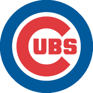 10. Chicago Cubs: 1979 – present (MLB)
The Cubs have been around forever. If it weren’t for that pesky Great Chicago Fire costing them the 1872 and 1873 seasons, they would be the oldest sports franchise in the country. Since the late 1900s, the Cubs have kept the same basic theme with their logo: A large “C” and something in the middle. In the first part of the century, it was usually a bear. Since the 30s, it’s been “U-B-S.” The latest (and best) incarnation came about in 1979 and has seen the likes of Sandberg, Dawson, Maddux and Sosa. It’s simple and clean and contained completely within a circle. I don’t typically like logos that are entirely contained within a circle, but the interior “C” helps to break up the circle’s impact visually. You can never go wrong with red and blue. It doesn’t tell you anything about Chicago or their mascot, but it does tell you something very important about the Chicago Cubs: They’re a historic franchise that have never needed a huge makeover. Their logo is a fairly modern take on a simple concept. It’s proof that sometimes simpler is better.
 9. Portland Trail Blazers: 1970/71 – 1989/90 (NBA)
This is the lone NBA representative on this list. And it seems an unlikely choice. There’s nothing in this logo that tells you anything about the team. Absolutely nothing. Some people suggest that the logo is a backwards “p” and “b” but I can’t verify that. The font used in the wordmark is certainly echoed in the logo. And if you’re willing to take it a step further, you could probably get a “t” out of there. Anyhow, at first glance, it does have some things going for it: Clean lines, a simple and distinct shape and it’s self-contained without being completely enclosed in a circle. The logo creates a sense of movement, and it feels dynamic despite its simplicity.
I also like the choice of non-traditional colors. I read one comment that said black and red were used to mark the Oregon Trail but haven’t been able to verify that via an admittedly brief Google session. If it is true, that’s a stroke of genius. But there’s another stroke of genius, one that’s far more subtle. Both the red element and the black element are made up of five lines. And, of course, basketball is a game of five on five. So you have a (very) abstract representation of the game the Trail Blazers are playing. You can even take it further and suggest that sense of movement brings the five lines to meet in the circle at center court. One last thing: It just screams classic 70s.
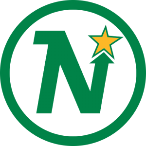 8. Minnesota North Stars: 1967/68 – 1973/74 (NHL)
Perhaps hockey teams seem to spend a little more time than other sports on their image and identity. Or it may be because their logos appear more prominently on their uniforms. It may be because a lot of these teams showed up later on when identities became more important with more exposure. Until 1967, there were only six teams in the NHL. At that point, the league doubled in size. One of those teams was the Minnesota North Stars.
None of the expansion teams of ’67 were Canadian. The team farthest north was Minnesota. And when you think hockey, you look north. Like the Cubs logo, this one is simple and easy to use in various formats. It gives you an idea where Minnesota is in relation to the other American teams and evokes the team’s branding. The “N” has a nice fluidity; it creates a sense of movement that leads you to the star. The star fits snugly into the arrow, which is pointing up, the usual direction for north. Not only does it lead you into the star, but it takes you north to hockey’s homeland. And of course the star is yellow which always goes well with green. When the North Stars moved south to Dallas, they dropped the “North” and the logo lost everything that made it special.
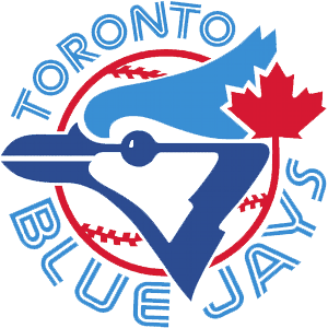 7. Toronto Blue Jays: 1977 – 1996 (MLB)
This is a complex logo. It has a lot of competing pieces, lots of swooping lines and a non-traditional font. At the same time, for a logo from the 70s, it has a surprisingly modern representation of a blue jay: Angular and abstract. It incorporates Canada’s maple leaf without distracting the viewer from the rest of the logo. While I’m not a fan of using sports equipment in a logo, it seems to work here: The ball creates focus and helps define the logo’s shape that might otherwise seem to sprawl in all directions. The blue is an obvious choice but the red is not. Blue and red verges on the traditional American colors used by a number of teams. But here it provides a contrast that helps to, again, focus the logo and contain its pieces. If you ignore the text, it tells you most of what you’d need to know: the team is Canadian, probably called the Blue Jays and they play baseball.
And when you compare it to their horrible current logo, this logo is a work of art, worthy of a wall at the Louvre.
 6. Pittsburgh Steelers: 1963 – present (NFL)
You should know this logo. This logo probably violates any rule I could put on paper about what logos should or should not do. It’s completely surrounded in a circle, it contains colors that are not part of the team’s official colors, it’s basically copied from another organization’s logo. And so on. The logo’s history tells part of the story. It was created in 1960 for the American Iron and Steel Institute, and it originally said just “Steel” on the left side. The three shapes on the right side are called astroids, which are “hypocycloids with four cusps” (yeah, I know, just go here). A company called Republic Steel (from Cleveland!) asked the Steelers’ owners about putting the logo, the Steelmark, on their helmets. In 1963, the Steelers asked if they could change “Steel” to “Steelers” and there you have it. The colors do mean something: Yellow is coal, red (originally orange) is iron ore and blue is for scrap metal. So that the Steelers could trademark it, they made the astroids bigger and changed the middle one to red.
So, how does all of this make a good logo? Because what started as the symbol for an industry turned into one of the most iconic brands in not just the NFL but all of professional sports. It shows how seemingly random shapes and colors can come together in a clean, classic design. And to underscore all of that, what amounts to an advertisement for the steel industry turned into the logo for a football franchise that had been around for 30 years before the logo even existed. Can you imagine that happening today? Scratch that and try this: Can you imagine that happening so overtly today?
 5. California Golden Seals: 1970/71 – 1973/74 (NHL)
Wait, you’ve never heard of the California Golden Seals? Well, you’re in good company. I doubt anyone who wasn’t a hockey fan in the 60s and 70s has. They were part of the expansion in 1967 that also brought the North Stars to the NHL. They were the California Seals, then the Oakland Seals and then finally the California Golden Seals. After that, they moved to Cleveland and then merged with the North Stars. But while they were in the Bay Area, the Seals kept the same basic logo: An abstract seal with a hockey stick coming out of a “C.” I’ll admit that this logo didn’t catch my eye when I first saw it. But like the Trail Blazers logo, it grew on me. There are no hidden pieces, no subtle elements. It’s just a straight logo, and that might be the part I like the most. It’s got a lot going on but it’s not overwhelming.
The “C” is good: As I’ve said, as a general rule, logos should use circular elements to contain most of the logo, not all of it. Even when they were the Oakland Seals, the seal’s head spilled out of the “O” (that was converted from the “C”). The seal is not a simple. Like the Blue Jays’ logo, the representation is remarkably ahead of its time. And like the Blue Jays’ logo, the animal isn’t represented as aggressive, but as neutral or even “happy” as was common before the 90s. The aggressive animal logo phenomenon came later and is all the rage over the past 10 or so years (see the most recent logo changes for the Seahawks, Lions, Dolphins, Blue Jays and nearly every minor league baseball team).
Of course, a seal is a good choice for a team name in the Bay Area, it being home to the California sea lions and harbor seals. Additionally, there was the San Francisco Seals, the minor league team that Joe DiMaggio played for. The fact the seal is holding a hockey stick is something I’d normally dislike but here it helps to balance the composition. There’s a lot of unused space inside the “C” which was filled in with green. I’m okay with that, too, for the same reason: It gives the logo a nice balance and helps the yellow elements stand out.
This is the kind of fun logo you’ll never seen again. It would be considered too flat, too static, too something. But it’s bold and holds up well to this day. It’s a good mix of an old football or baseball logo and something you might see today. To that effect, this is a unique work that we may never see the likes of again.
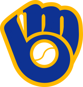 4. Milwaukee Brewers: 1978 – 1993 (MLB)
I remember always seeing this logo on baseball cards and thinking, I don’t understand why the Brewers use a glove and ball as their logo. I just didn’t get it. And it took me a while to get it. My wife, on the other hand, got it immediately when she saw it. It’s an “m” and a “b” of course, and it’s flawlessly molded into a baseball glove, the empty space in the “b” serving as a baseball. It has a cartoonish quality to it: The font is bubbly and uneven, the outline is thick and the ball is, well, anatomically incorrect. But these qualities give it that fun quality. It’s a nice reminder that, hey, sports can be fun sometimes.
This logo is also a good example of how a team can create an identity crisis for itself. It establishes an identity, sticks with it for a long time, and then changes it for no apparent reason. This logo was on the hats of Robin Yount, Paul Molitor and Rollie Fingers. And then the team altered its colors, did away with the ball and glove logo and created an entirely new identity. And a decade later, the Brewers brought this logo back as a third uniform. The Blue Jays did the same thing. There’s a reason people like throwback uniforms: They’re usually better.
 3. Montreal Expos: 1969 – 1991 (MLB)
We’re going north of the border again. When I was a kid, I watched the Atlanta Braves on TBS religiously, and they seemed to be playing in Montreal 100 times a year. I always wondered about the logo on their hat: It appeared to spell out “elb,” and I had no idea what that meant. A former co-worker of mine was an Expos fan. (Really, his license plate was “XPOSFAN”.) He told me that it spelled out “eMb” with the “e” and “b” forming part of the “M”. Admittedly, the “M” is hard to see at first, but it’s there and stylized in a way that feels like it represents Montreal well (though I cannot tell you why).
So, why “eMb” then? Well, in French, it stands for équipe de Montréal baseball, which translates into “Montreal Baseball Team.” But, wait, there’s more! Shuffle those letters around and you get “Meb” and they left it in English for you: “Montreal Expos Baseball.”
So in one little, three-color shape you have the team’s insignia, a description of the organization in French and a description of the club. It’s simple and unique and stands out as one of the better baseball logos in history. It may not be iconic like the Yankees’ “NY” or the Brooklyn Dodgers’ “B”, but it’s clever and captures that certain je ne sais quoi.
 2. Hartford Whalers: 1979/80 – 1991/92 (NHL)
When the Whalers moved to Raleigh and became the Carolina Hurricanes, this logo disappeared from the sports world. This is one of those logos that probably flew under the radar: It’s a very small city in the fourth sport of the Big 4. I’m not a big fan of whaling and all, but I’m pretty sure there’s no other team called the Whalers in the sports world (unless there’s some small liberal arts college playing Division III basketball I don’t know about). The Whalers’ logo took advantage of an design element you rarely see: Negative space. Think the FedEx logo, the way the white area between the “E” and the “x” forms an arrow. You probably never noticed it. But once you see it, you’ll never stop seeing it. That arrow is the negative space.
In this logo, you have the “W” at the bottom. Pretty obvious. At the top, you have the two flukes. That alone would be a pretty decent logo. But graphic designers are sometimes pretty damn good at what they do. And good ones will use that negative space when it can be used effectively. In-between the “W” and the flukes you have a stylized “H”. So, in one compact space you have the first letter of the city, the first letter of the team name, and a graphical representation of the team name (or what the team name would be killing, I guess). Another nice touch is that the outsides of the “W” are rounded to give it the feel of water. It’s like the tail is coming out of the water.
This logo is similar to the Expos logo in what it accomplishes. It takes a lot of pieces and puts them in a clean, simple form. There’s nothing flash about it. It doesn’t use a lot of colors or any sense of depth to give the team an identity. And like the Expos logo, it manages to endure even though the team itself is no longer around.
 1. Vancouver Canucks: 1970/71 – 1979/1980 (NHL)
I don’t know where to begin with this logo. So many things are represented in such a simple design. If there’s a problem with it, it’s that people don’t know what’s being represented. It’s too damn good for its own good.
The somewhat obvious: It’s contained within a hockey rink and there’s a hockey stick cutting across the right side. Thus the nickname “stick-in-rink” logo. Some people don’t pick up on the rink but the stick is clear. The colors weren’t just chosen because they look good together (they do) but because they represent three natural characteristics of Vancouver: The blue water, the green trees and the white snow of the mountains. Then we begin to dig deeper. The hockey stick breaks the outline and creates a very, very stylized “C”, and one could go so far as to say that the negative space in the stick itself serves as a very shallow “V”. Then you get to the flat out esoteric: That hockey stick forms the mouth and jaw line of an abstract whale head.
I know a lot of people hear all of this and just shake their heads. That’s the problem I mentioned earlier: A lot’s going on but it’s all really subtle. Even the “C” is subtle. Most people see a hockey stick in a swimming pool. Even if this was simply a hockey stick in a swimming pool, it would still be one of the best logos ever created. It’s clean, simple and nice to look at.
In the end, logos often define a team’s identity. You’ll always know that the hockey stick in the swimming pool logo belongs to the Canucks. The longer a logo sticks around, the more entrenched that identity gets. That’s why some baseball teams can hang on to the most generic of logos (think the Tigers’ script “D”). No sports fan in North America is going to look at that and wonder what team it is. But for teams that haven’t been around since the turn of the century, you have to create an identity and stick with it, good or bad (good’s usually better, though).
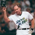 10. Wade Boggs, Tampa Bay Devil Rays
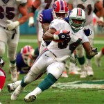 9. Thurman Thomas, Miami Dolphins
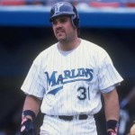 8. Mike Piazza, Florida Marlins
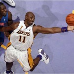 7. Karl Malone, Los Angeles Lakers
 6. Wayne Gretzky, St. Louis Blues
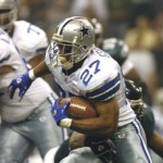 5. Eddie George, Dallas Cowboys
 4. Hakeem Olajuwon, Toronto Raptors
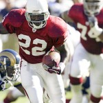 3. Emmitt Smith, Arizona Cardinals
 2. Joe Montana, Kansas City Chiefs
 1. Michael Jordan, Washington Wizards
 10. Ray Lewis, LB, Baltimore Ravens: Yeah, Ray has lost a step. In fact, he’s probably only the third or fourth best player on his own defense at this point. That said, if it goes down, give me someone such as Ray-Ray, a wily vet with a noted mean streak, a ripped physique, unmatched intensity and an innate leadership quality. Plus, tell me
 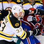 9. Zdeno Chara, Defenseman, Boston Bruins: I don’t pretend to know much about hockey, but I do know that anytime a guy
 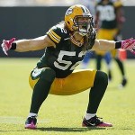 8. Clay Matthews, Linebacker, Green Bay Packers.
  7. Manny Pacquiao, Boxer/Politician: The reasoning for this is simple … boxing is a sport in which success is measured by one’s ability to pummel his opponent into submission with his fists. No one in the world does this better than “Pac-Man.” Let’s move on.
 6. The Undertaker, Professional Wrestler/Dead Man: Think it’s fake, huh? Try telling that to this 7-foot, 300-plus-pound Houstonian behemoth who, by the way, also trains in mixed martial arts. Plus, his 19-0 record at WrestleMania is professional wrestling’s 56-game hitting streak.
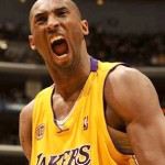 5. Kobe Bryant, Guard, Los Angeles Lakers: He’s not intimidating in terms of pure physical force, but Bryant’s intensity, work ethic and will to prevail on the court are second only to one Michael Jordan. Personally, that frightens me, if only because it indicates that Kobe is the type to sneak a shiv into a fists-only streetfight.
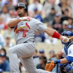 4. Albert Pujols, First Baseman, St. Louis Cardinals: By all accounts a good guy on and off the diamond, Pujols nonetheless looks like the meanest bouncer at the bar, the guy who spent all day working out in the hopes of inciting a riot later that night. His muscles have muscles. Hell,
 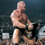 3. Brock Lesnar, UFC Heavyweight/Ill-Tempered Minnesotan: No, Brock Lesnar is not an elite UFC competitor, at least not on par with the Anderson Silvas of the cage fighting world. That said,
 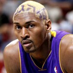 2. Ron Artest (aka Metta World Peace), Forward/Resident Lunatic, Los Angeles Lakers: The eyes don’t lie. Whether it’s that formerly-crazy girlfriend who alleges to have changed her ways, or a former
 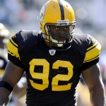 1. James Harrison, Linebacker/Gun Enthusiast/Disgruntled NFL Employee, Pittsburgh Steelers: Easy call. Harrison is a 6-foot, 250-pound, mean-spirited, hard-hitting, gun-toting madman. A former Defensive Player of the Year,
  10. Tampa Bay Buccaneers 48 – Oakland Raiders 21 (Super Bowl XXXVII) » At age 37, Rich Gannon threw for 4,689 yards, won the league MVP and took the Raiders to their first Super Bowl since 1983. The oddsmakers favored their top-rated offense by 4 against Jon Gruden’s top-rated defense, but by the time the third quarter ended, it was obvious that defense did, in fact, win championships. Gruden had gotten revenge against his previous team, and the Al Davis affliction in sunny California continued to persist.
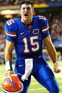 2007 BCS National Championship Game) » Troy Smith, Ted Ginn and Anthony Gonzalez made the Buckeyes look invincible throughout the season (which included a 24-7 dismantling of defending champions from the University of Texas). Aside from a late game comeback by rival Michigan, Ohio State was never in danger of losing a game. This was supposed to be one of the most lopsided deciding bowl games ever. But Chris Leak, Percy Harvin and some fellow named Tim Tebow had other ideas. After the Buckeyes returned the initial kickoff, Harvin matched—and it was a cakewalk for the remainder. It was lopsided, alright, just on the other side.
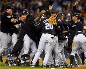 8. Florida Marlins 4 – New York Yankees 2 (2003 World Series) » Money doesn’t always make you happy, and money definitely can’t buy you championships. The Marlins shocked the Yankees (and their $110 million difference in payroll) by riding Josh Beckett to the glory land for the second time in seven years. Along the way, though, they had some extra help from a Cubs fan whose memorabilia-hogging instincts kept the grand prize away for his cursed team.
 7. Greece 1 – Portugal 0 (Euro 2004) » Greece’s improbable run at Euro 2004 was capped with a second defeat of Luiz Felipe Scolari’s Portuguese squad, headlined by Luis Figo and Cristiano Ronaldo, who failed to avenge their opening day loss. Along the way, they also beat France and England. It’s possible to pad this further, but seriously, there shouldn’t be any other data necessary: Greece won Euro 2004 by defeating three powerhouses four times total. That’s the math, and that’s pretty amazing.
 6. Maria Sharapova (6-1, 6-4) over Serena Williams (2004 Wimbledon) » Out of nowhere, 13th seeded, 17-year-old Sharapova beats two-time defending champion and #1 seed Williams in straight sets. This was a passing of the torch, of sorts, not unlike Federer beating Sampras in 2001. Of course, Serena continued her dominance for a while longer, but she’ll never forget the spark she provided to Sharapova’s career at Centre Court.
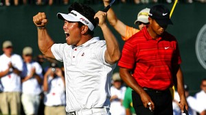 5. Y.E. Yang (-8) over Tiger Woods (-5) (2009 PGA Championship) » Golf isn’t a head-to-head sport, but when you take into effect that Yang and Woods were paired up for the final round at the Hazeltine National Golf Club, you can imagine how intense it must have been throughout the day. Tiger entered the day with a 2 shot lead before ending the day +3, in the process witnessing the first Asian-born player to win a major on the PGA tour. This was all the more impressive as Yang didn’t start playing golf until age 19. The maturing prodigy was defeated by the budding late-bloomer.
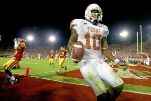 4. Texas 41 – USC 38 (2006 Rose Bowl/BCS National Championship Game) » Matt Leinart this. Reggie Bush that. For all the hype the media loves to generate, there’s probably no doubt amongst college football fanatics that this Trojans team was one of the greatest to ever play. But there was one man who, frankly, didn’t give a damn: Vince Young. He had put in the single greatest individual performance I’ve ever witnessed by the time he crossed into the endzone on 4th and 2. While the awe and magic of a game like this may never again be repeated, Young’s lesson in media-founded histrionics will always be remembered.
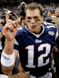 3. Patriots 20 – Rams 17 (Super Bowl XXXVI) » September 11 made New York City a solemn place to live. But for some reason, it felt as if supporting these mediocre “Patriots” would make us all happier. So, we did. Against “the Greatest Show on Turf.” Little did we know that we’d witness the genesis of one of the most hated dynasties in sports history, and that of a man who would end up marrying the world’s highest-paid supermodel and have hair softer than Justin Bieber.
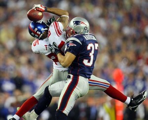 2. Giants 17 – Patriots 14 (Super Bowl XLII) » 18-1.

 9. Portland Trail Blazers: 1970/71 – 1989/90 (NBA)
 8. Minnesota North Stars: 1967/68 – 1973/74 (NHL)
 7. Toronto Blue Jays: 1977 – 1996 (MLB)
  6. Pittsburgh Steelers: 1963 – present (NFL)
 5. California Golden Seals: 1970/71 – 1973/74 (NHL)
 4. Milwaukee Brewers: 1978 – 1993 (MLB)
 3. Montreal Expos: 1969 – 1991 (MLB)
 2. Hartford Whalers: 1979/80 – 1991/92 (NHL)
 1. Vancouver Canucks: 1970/71 – 1979/1980 (NHL)